
Date Posted: August 27, 2025
Even small tweaks to a website can have a surprising impact on how many visitors become customers.
The right design elements gently nudge people toward taking action—perhaps buying something, signing up for a newsletter, or reaching out through a contact form.
Good website design can boost conversion rates by 200% or more when the right elements work together. Visitors can find what they need fast and feel more confident about making choices.
The best sites employ proven design strategies that break down barriers and foster trust. Fast loading times, clear navigation, mobile-friendly layouts, and strong calls-to-action make a real difference.
Key Takeaways
- Fast-loading pages with clear navigation help visitors find what they need without frustration
- Trust signals, such as testimonials and security badges, make people feel safe to take action.
- Simple forms and obvious action buttons remove barriers that stop conversions from happening.

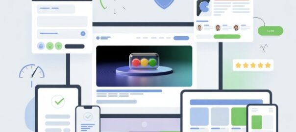
What Is Conversion-Focused Website Design?
Conversion-focused website design aims to turn visitors into customers. Designers use specific choices to guide users toward taking action.
This design style centers on what users need to reach their goals. Common goals? Making a purchase, signing up for emails, or filling out a form.
Key features include:
- Clear call-to-action buttons
- Simple navigation menus
- Fast loading speeds
- Mobile-friendly layouts
- Easy-to-read text
Designers remove anything that stops people from converting. They try to make the path to purchase as smooth as possible.
Colors, fonts, and button placement all matter here. Each element builds trust and encourages action in its own way.
Conversion-focused design leans on data and testing. Designers track what works, ditch what doesn’t, and adjust based on real user behavior.
Common conversion goals:
| Goal Type | Example |
| Sales | Buy a product |
| Leads | Download a guide |
| Engagement | Sign up for the newsletter |
| Contact | Fill out the form |
What is the main difference from regular design? Purpose. Every element serves a function—nothing’s there just for decoration.
This approach enables businesses to maximize the value of their websites. You can turn more visitors into paying customers without needing to chase more traffic.
Want a website that actually turns visitors into customers? 800Commerce designs conversion-focused websites that deliver real ROI. Book your free consultation today.
Why Navigation Matters For Conversion Rates

Clear navigation lets visitors find what they want quickly. Bad navigation can be frustrating and lead to customers leaving before making a purchase.
Key Practices
Keep menus simple and organized. Stick with no more than seven main categories in your top menu. It helps to group related items under clear labels.
Make your search bar easy to find. Put it in the header where folks expect it. Add filters so people can quickly narrow down results.
Use breadcrumb trails on product pages. Breadcrumbs show users their current location and make it easy to navigate back to previous pages.
Create clear call-to-action buttons. Use action words like “Buy Now” or “Add to Cart.” Bright colors that pop against your background work best.
Test your mobile navigation. Over half of web traffic comes from phones now. Verify that your menu functions properly on small screens.
Mobile Responsiveness As A Must-Have In 2025
Mobile devices now account for over 60% of all web traffic. Most people browse on phones or tablets instead of computers these days.
A mobile-responsive website shifts its layout to fit any screen size. Text, images, and buttons resize automatically to look decent everywhere.
Key mobile design features include:
- Touch-friendly buttons you can actually tap
- Text that’s big enough to read without pinching or zooming
- Fast loading even on slow mobile networks
- Simple navigation menus
If a site doesn’t work on mobile, it loses customers in a flash. People leave in seconds if they can’t browse or buy easily.
Google ranks mobile-friendly sites higher in search results. Responsive design affects both user experience and search visibility.
Mobile shopping just keeps growing. Customers want to buy smoothly on their phones. If checkout feels clunky, expect a higher rate of abandoned carts.
The most successful sites in 2025 prioritize mobile users. Many designers actually build the mobile version before tackling the desktop site.
Testing on real devices helps identify problems that might be missed. Phones and tablets sometimes show things differently than you’d expect.
Simple layouts just work better on small screens. Too many crowded elements make mobile browsing a headache.
Mobile responsiveness is no longer optional if you want to stay competitive online.
How Page Speed Impacts Conversions
Slow-loading pages kill conversion rates. Every extra second of delay can result in a 7% drop in conversions. People expect pages to load in 2-3 seconds—if not, they’re gone.
Optimization Tactics
Image compression reduces file sizes without compromising image quality. Tools like TinyPNG or WebP can reduce image sizes by up to half or more.
Minifying CSS and JavaScript removes unnecessary spaces and code clutter. This usually trims file sizes by 10-20%.
Browser caching saves website files on a user’s device. When visitors return, their browser loads content faster since it doesn’t have to download everything again.
Content delivery networks (CDNs) serve up your site from servers closer to users. That shortens the distance data travels and can speed up loading by 30-50%.
Database optimization involves cleaning up outdated data and indexing frequently used data. A tidy database responds to queries way faster—sometimes two to five times quicker than a messy one.
Visual Hierarchy That Guides User Attention
Visual hierarchy helps users know where to look first. Designers use different elements to guide the eye from the most important content down to the details.
Size matters most in visual hierarchy. Big elements grab attention before small ones. Headlines should be larger than body text. Important buttons need to look weightier than the rest.
Color draws the eye. Bright colors pop against neutral backgrounds. Red buttons, for example, often get more clicks than gray ones—they’re just hard to ignore.
Contrast makes things stand out. Dark text on light backgrounds is easier to read. White space around key elements helps them stand out.
Position matters, too. People scan websites in certain patterns:
| Scanning Pattern | Description |
| F-Pattern | Users read top to bottom, left to right |
| Z-Pattern | Eyes move in a zigzag across the page |
| Layer-Cake | Users scan horizontally across sections |
Typography brings order. Varying font sizes show what matters most. Bold text grabs attention faster than regular text. Sans-serif fonts are just easier to read online.
Images naturally direct attention. If someone in a photo looks toward your call-to-action button, users tend to follow their gaze. Product images should be bigger than supporting graphics.
White space keeps layouts from feeling cramped. Empty space around important stuff helps it stand out. Crowded pages just confuse people and hurt conversions.
Good hierarchy feels natural. Visitors find what they need without even thinking about it. That kind of smooth experience leads to more clicks and sales.
Even minor design tweaks can double your conversions. Let 800Commerce optimize your navigation, CTAs, and checkout flow. Claim your free website performance audit now.
Trust Signals That Increase Credibility
Trust signals help visitors feel safe on a website. They show that a business is real and trustworthy. People are more likely to buy when they trust a website.
Calls-To-Action That Actually Convert
A call-to-action button informs visitors of the next step. The most effective CTAs utilize action words that evoke a sense of urgency.
Strong CTA words include:
- Get
- Start
- Download
- Join
- Buy Now
- Try Free
The button color needs to pop against the page. Red, orange, and green buttons usually get more clicks than blue or gray ones.
Size matters for CTA buttons. Make them big enough to spot easily, but not so huge that they look awkward.
Button placement matters:
- Above the fold gets seen first
- End of product descriptions works well
- Multiple CTAs can help on long pages
The text around the button should explain what happens next. People want to know what they’ll get if they click.
| Good CTA Text | Bad CTA Text |
| Start Your Free Trial | Submit |
| Get My Discount | Click Here |
| Download Guide Now | Learn More |
Testing different CTA versions reveals which ones are most effective. Sometimes, just changing a word or color can raise clicks by 20% or more.
CTAs are most effective when they align with what the visitor expects. If someone’s looking at pricing, show “Buy Now,” not “Learn More.”
Mobile users need bigger buttons that are easy to tap. Go for at least 44 pixels tall and wide—nobody likes to miss a button on their phone.
Optimizing Forms And Checkout Processes
Forms and checkout pages can make or break a sale. Poor design drives customers away before they complete their purchase.
Keep forms short and simple. Only ask for information you truly need.
Each additional field reduces the likelihood that someone will complete the form. Remove optional fields when you can.
Mark required fields clearly—use asterisks or bold text so nobody has to guess.
Stick to single-column layouts for forms. It provides users with a clear path from top to bottom.
Make buttons stand out. Select bright colors that stand out against your background.
Ensure buttons are large enough to tap easily, especially on mobile devices.
| Button Best Practices |
| Use action words like “Buy Now” or “Complete Order” |
| Make buttons at least 44 pixels tall |
| Place primary buttons on the right side |
| Avoid using red for submit buttons |
Show progress indicators if checkout takes more than one step. People want to know what’s left before they finish.
Enable guest checkout options. Forcing account creation turns shoppers away. Let folks buy first and sign up later if they want.
Put security badges near payment fields. Customers feel more confident about entering their credit card information when they see those.
Use real-time validation so people catch mistakes right away. Show green checkmarks when they get it right—makes things smoother.
Minimize loading times between checkout steps. Slow pages send customers to shop elsewhere.
Test your forms regularly on mobile devices. Most people shop on their phones now, so it’s got to work there.
The Role Of Multimedia In Engagement
Videos keep visitors on your site longer than just text. They explain products and services in a way that’s easy to understand.
Short videos usually work best for holding attention. Images make web pages more visually appealing.
People scan websites quickly, and high-quality photos capture their attention. High-quality images build trust with visitors.
Interactive elements, such as sliders and hover effects, encourage users to explore further. These features create a more hands-on experience.
Users spend more time on sites that respond to their actions. Audio can enhance the user experience when used carefully.
Background music should be subtle, and honestly, it’s better if people can turn it off. Autoplay sounds? That’s a quick way to lose visitors.
Different types of multimedia serve different purposes:
- Product videos show how items work
- Customer testimonials build social proof
- Interactive demos let users try before buying
- Image galleries display multiple views
Loading speed matters with multimedia content. Large files slow things down, and nobody likes waiting for a page to load.
Mobile users require videos and images that are optimized for their devices. Videos should play smoothly on phones and tablets.
Images have to be resized properly for smaller screens. Accessibility features help everyone get something out of your multimedia.
Captions make videos accessible to deaf users, while alt text describes images for those who are visually impaired.
Tracking, Testing, And Continuous Improvement
Website owners need data to make informed decisions and implement smart changes. They should track user behavior to see what works and what doesn’t.
Key metrics to monitor:
- Conversion rates
- Click-through rates
- Bounce rates
- Time on page
- Form completion rates
Want to know what’s actually working? A/B testing lets you compare different versions of a page.
Business owners can tweak one thing at a time and see which version connects better with visitors.
Common elements to test include:
- Headlines
- Button colors and text
- Form layouts
- Images
- Call-to-action placement
Heat mapping tools show exactly where users click and scroll. You’ll see which parts of a page actually grab attention—and which get ignored.
Google Analytics offers free tracking for most websites. It shows you visitor patterns and conversion paths.
Testing isn’t something you just do once and forget. Markets shift, and honestly, user preferences can change faster than you’d expect.
Sometimes, a minor adjustment can make a significant difference. Change a button color, and maybe clicks jump by 20%—who knew?
Move a form higher up, and suddenly, more people sign up. It’s not always predictable, but it’s worth experimenting.
Testing best practices:
- Run tests for at least one week
- Test only one element at a time
- Use enough traffic for reliable results
- Document all changes made
It’s a good idea to review your website’s performance regularly. Check your data periodically, such as once a month, and adjust settings based on the findings.
Stop losing leads to poor design. With 800Commerce’s CRO-driven websites, businesses in Fort Lauderdale experience measurable growth. Schedule your free strategy session today.
Frequently Asked Questions
What is conversion-focused website design?
It’s a design approach where every element—navigation, CTAs, forms, and trust signals—is optimized to guide visitors toward specific actions like purchases or sign-ups.
How much can good design improve conversion rates?
Strong design can boost conversions by 200% or more, especially when combined with fast load times, mobile responsiveness, and trust-building features.
Why is mobile responsiveness important for conversions?
Over 60% of traffic comes from mobile devices, and responsive sites keep visitors engaged, reduce bounce rates, and drive more completed purchases.
How does page speed impact conversion rates?
Every second of delay can lower conversions by about 7%. For optimal results, pages should load in under 3 seconds.
What trust signals help increase credibility?
Testimonials, reviews, client logos, case studies, and SSL/security badges reassure visitors and increase their likelihood of conversion.
How many CTAs should a website have?
Most pages should have at least one clear CTA, with long-form pages including 3–5 CTAs placed naturally throughout.
How can I measure if my design changes improve conversions?
Track conversion rates, form completions, click-through rates, and time on page using Google Analytics, heatmaps, and A/B testing.