
Date Posted: May 22, 2025
The colors on your mediation website do more than just look good—they shape how visitors feel, whether they trust you, and even whether they reach out for help.
Selecting the right color palette helps your website set a calming, professional tone, which is important for anyone seeking mediation services.
Different colors stir up different emotions. Blues and greens might remind people of peace and safety, while warmer colors could spark energy or maybe even caution.
Understanding color psychology helps your site stand out and makes visitors feel comfortable from the first second.
When your palette matches your desired mood, people tend to stick around, remember your brand, and maybe even reach out for support.
Key Takeaways
- The right color palette builds trust and comfort for visitors
- Color choices can influence how people feel and interact with your brand
- Using color psychology helps your mediation website stand out and succeed
Why Color Psychology Matters In Mediation Marketing

The colors on your mediation website shape how people feel about your services. Using smart color psychology in legal web design helps you connect with clients and build instant trust.
First Impressions Influence Emotional Safety
Colors hit our emotions in seconds. When someone lands on your site, your color palette instantly makes them feel comfortable—or not.
In mediation branding design, calm shades like soft blues, gentle greens, and neutrals help people breathe a little easier.
A well-chosen color scheme can lower anxiety and make it easier for clients to explore what you offer. People searching for mediation are often stressed or uncertain.
Soft colors quietly signal that your services are welcoming, neutral, and safe.
Key tips:
- Stick with a consistent palette for headers, buttons, and backgrounds.
- Avoid harsh contrasts or super-bright reds—they can ramp up stress.
- Test different colors with real users to see which ones get the best reactions.
Building A Trustworthy Online Presence
Trust matters a lot in mediation. The best legal website color branding tips focus on colors that show professionalism and reliability.
Blue often gets linked with trust and stability, while muted earth tones feel dependable.
A strong color palette also helps people remember your brand. Research even says color can boost brand recognition by up to 80%.
Consistency in your colors—logos, CTAs, menus—lets people know they’re in the right place.
Checklist for building trust:
- Pick two or three main colors and use them everywhere on your site.
- Leave plenty of white space for a clean, inviting look.
- Skip trendy colors that don’t fit legal or mediation fields, like neon green.
How Color Affects Emotions And Perceived Trust
Color choices can impact how visitors feel about your mediation website. The right palette can help people relax and feel they can trust you.
Neuroscience Of Color In Conflict Resolution
Your brain responds to colors almost instantly. Certain colors, like blues and greens, spark areas in the brain tied to calmness and safety.
These shades work well in conflict resolution settings, lowering stress and encouraging thoughtful communication.
Neutrals like soft gray or tan also support a calming UI for mediation services. Legal websites often use these tones to help people feel less anxious while searching for help.
Blue stands out as a trust-building color for websites. It signals dependability and honesty, which is why it is used on many mediation sites.
Yellows and oranges can bring optimism, but it’s easy to overdo it. Too much can feel overwhelming or even unprofessional.
Finding the right balance increases the odds that users will feel comfortable opening up and working toward a resolution.
Warm Vs. Cool Tones In The Mediation Context
Warm colors like red or bright orange inspire energy but might also cause tension or urgency. Red can signal a warning, which isn’t always helpful in mediation.
Too many warm tones might distract or even put off clients who want a peaceful solution.
Cool tones—especially blue and green—work as calming website colors for mediators. They help create a peaceful digital space that makes clients feel welcome.
Cool colors foster trust and connect with professionalism in legal branding. Green, for example, represents growth and balance, which is perfect for those seeking resolution.
Want your mediation website to build instant trust? 800Commerce can design a calm, professional color palette that speaks volumes to potential clients before they even read a word. Reach out today.
Here’s a quick table showing how common colors are perceived in mediation website design:
| Color | Emotion | Usefulness |
| Blue | Trust, calm | Builds trust |
| Green | Balance, growth | Calms, reassures |
| Gray | Neutral, steady | Soothes anxiety |
| Yellow | Optimism, warmth | Use with care |
| Red | Urgency, energy | Use sparingly |
Interpreting Color Associations For Mediators
Picking the right colors for your mediation website helps set the right mood and supports your message. Each color brings a unique vibe and can influence how potential clients see your services.
Blue – Calm, Professionalism, Reliability
Mediators and legal professionals frequently use blue because it evokes calm, trust, and reliability. Using blue on your site makes visitors feel more at ease and shows you’re serious about helping them resolve conflicts.
A palette built around blue suggests transparency and professionalism—exactly what clients want in a mediator. Soft blue backgrounds or accents can reduce stress and help create order and structure.
If you want your site to look credible and inviting, blue is a safe bet. It’s also the top pick for many legal and mediation websites that aim for a welcoming but professional space.
Green – Balance, Stability, And Renewal
Green is the color of new beginnings, balance, and stability. In mediation, green is a smart choice because it sends a peaceful message and encourages positive change.
Green reduces anxiety, which is key for clients dealing with conflict or stress. It also symbolizes growth, harmony, and resolution—important goals for any mediation practice.
Lighter greens give a gentle feel, while deeper tones add reassurance. Green makes a strong case for mediation services focused on stability and renewal..
Neutral Tones – Objectivity And Warmth
Neutral colors like gray, beige, and soft whites create a background that projects objectivity and warmth. They don’t distract from your content and show that your practice is unbiased and non-judgmental.
You can pair neutral backgrounds with stronger accent colors to keep your design simple and approachable. A neutral color palette for lawyers helps your site appeal to a wider range of clients by avoiding strong emotional signals.
Neutrals make your website look modern and clean. They increase readability and draw attention to what matters most.
When used well, they support a calm, open environment where visitors feel comfortable and heard.
Purple Or Teal – Sophistication Or Empathy
Purple brings sophistication, wisdom, and creativity. It can show that your mediation practice offers thoughtful solutions and expertise.
Rich purples work well in accents, headlines, or calls to action if you want to highlight uniqueness or special services.
Teal blends the stability of blue with the renewal of green, making it great for mediators who want to show empathy and clarity. It gives off an open and caring attitude, which helps create emotional comfort for clients.
Purple and teal aren’t as common as blue or green, so they help you stand out. Used thoughtfully, they make your practice memorable and approachable for people seeking unique solutions.
If you focus on emotional support or specialized services, purple or teal can highlight your strengths in an emotional color strategy for mediation practices.
How To Build A Strategic Color Palette

Choosing your website colors sets the mood and affects how people feel and act when they visit. Color should fit your audience, reinforce trust, and support your goals in online mediation.
Identify Your Primary Audience
Knowing your audience really helps you pick colors that fit their expectations and comfort zones. A mediation website usually aims for calm, trust, and neutrality.
Blue is popular for its association with peace and reliability. If your audience is experiencing conflict or stress, try soft greens, cool blues, and gentle neutrals.
These are often the best colors for mediation websites because they avoid harshness and don’t trigger anxiety.
Check out what your competitors use and consider your unique approach. If your mediation service focuses on families, lighter tones might work best.
For business-focused platforms, you could add subtle grays or muted golds for a more professional feel. Adjust your colors based on what helps your audience feel safe and heard.
Apply The 60-30-10 Design Rule
A balanced color palette just feels right. It’s easier on the eyes and instantly looks more professional.
The 60-30-10 rule is a classic design strategy for managing your website’s visual hierarchy without overthinking it.
- 60%: Dominant Color (backgrounds or main sections; go for a calming shade—think soft blue or light gray—to set a peaceful tone)
- 30%: Secondary Color (headers, sidebars, or cards; maybe a gentle green, beige, or muted teal for some variety, but still keep it neutral)
- 10%: Accent Color (buttons or links; a subtle coral or gold adds a pop of interest and pulls the eye where you want it, but doesn’t steal the show)
Try to stick to three main colors. It’s easy to get carried away, but more than that, it usually leads to clutter and confusion, especially for the best UX colors on conflict resolution sites.
Too many bold or bright hues can feel aggressive or out of place. Less really is more here.
A/B Test Color Impact On Engagement
Once you’ve picked your palette, don’t just hope it works—test it out. Even small color tweaks can shift how people interact with your site.
Run A/B tests by showing users different color versions. Then, measure things like session time, clicks, or form completions.
For example, maybe blue buttons get more consultation bookings, or a certain background shade keeps people around longer. It’s worth experimenting.
Look at both the numbers and what users say. Sometimes the data tells one story, but feedback adds another layer of insight.
This is key when choosing a mediation site color palette that feels professional but still inviting.
Colors influence perception more than you think. Let 800Commerce help you align visual tone with your mediation brand’s values and boost conversions without saying a word.
Common Mistakes To Avoid In Mediation Site Design
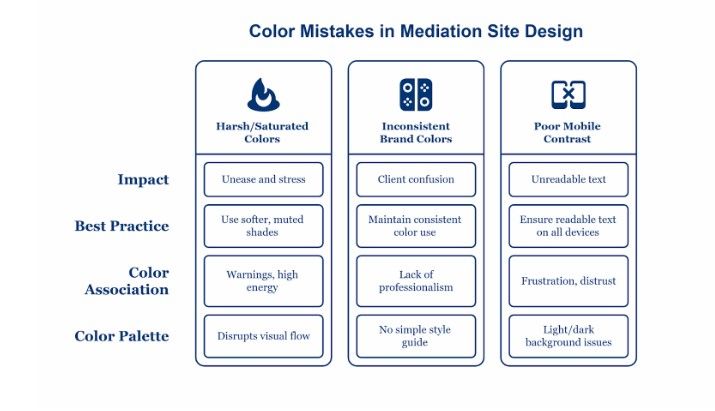
A professional mediation website needs a color palette that’s welcoming, calming, and matches your brand.
The right colors help build trust, but the wrong ones can hurt user experience and even block accessibility.
Using Harsh Or Saturated Colors
Bright reds, neon blues, or super-saturated greens grab attention but often make visitors uneasy or stressed.
Those colors are linked to warnings or high energy, not what someone wants when they’re seeking family law or divorce help.
Mediation websites work best with softer, muted shades, especially for family and divorce. Pale blues, gentle greens, and earthy neutrals set a reassuring mood.
These colors connect with calm and trust, which matters in legal and mediation settings. Using too many bold colors simultaneously disrupts visual flow and distracts from the important stuff.
Limiting your palette to a few colors keeps your site focused and professional.
Inconsistency Across Brand Assets
If your website, business cards, and social profiles don’t match, clients get confused. Consistent color use builds trust and helps people remember you.
Pick one core color set and use it everywhere—on your website header, call-to-action buttons, or even your logo.
Look at the top family mediation sites for inspiration and notice how their colors carry across materials.
Make a simple style guide or table with your brand’s hex codes and usage examples. That way, everyone—web designers, social media folks—sticks to the same palette.
Consistency just feels more professional, and it makes your mediation business easier to recognize.
Ignoring Mobile Responsiveness In Color Contrast
Most people will check your site on their phones. Color combos that look great on a desktop might look bad on mobile.
Poor contrast between text and background can make things unreadable, especially for people with vision issues. Always double-check how your colors show up on both light and dark backgrounds.
Good website design for divorce mediators means text is readable, no matter the device. Follow accessibility guidelines for contrast—at least a 4.5:1 ratio for normal text.
Use tools like contrast checkers to spot issues early. Focusing on color accessibility in legal websites shows that you care about every client, regardless of their abilities or devices.
Testing color contrast might feel tedious, but it prevents frustration and helps build trust in your services.
Final Thoughts
Color does so much more than decorate your website—it sets the mood for everyone who visits. The palette you choose guides how people feel and react almost instantly.
Pick the right colors, and you might create a sense of calm, trust, or even openness. That first impression? It matters more than you think.
Think about emotions for a second. Soft blues and greens tend to bring peace or balance, while warmer shades like beige or muted gold. They can make your site feel cozy and welcoming.
Here are a few key questions to keep in mind when you’re picking colors:
- What feeling do you want people to have?
- How do your colors reflect your brand’s message?
- Is the palette easy on the eyes?
Quick Comparison Table:
| Color | Emotion Evoked | Use for |
| Blue | Trust, Calm | Backgrounds, Headers |
| Green | Balance, Growth | Accents, Buttons |
| Beige | Warmth, Comfort | Backgrounds |
| Gold | Optimism, Value | Highlights, Details |
Always keep your visitors’ experience in mind. If possible, test your palette with real users—sometimes the smallest tweaks matter. You make a stronger first impression when your color choices match your message.
Ready to make your mediation website look as neutral and reassuring as your services feel? Connect with 800Commerce for custom color branding that supports conflict resolution from the first click.
Frequently Asked Questions
What are the best colors for a mediation website?
Blue, green, and neutral tones are ideal for mediation websites. These colors evoke trust, calmness, and neutrality, which are essential for conflict resolution environments.
Why is color psychology important in mediation web design?
Color psychology shapes first impressions and emotional responses. Calming tones reduce anxiety and build trust, making potential clients more likely to engage with your mediation services.
How many colors should a professional mediation site use?
Use a three-color system: 60% for primary color, 30% for secondary, and 10% for accents. This creates a balanced and visually appealing user experience.
Should mediators avoid red or black color schemes?
Yes. Red and black can signal aggression, urgency, or dominance—emotions that conflict with the peaceful, neutral tone needed in mediation branding.
What color combinations build trust online?
Soft blues, muted greens, and warm neutrals are proven to increase feelings of trust, stability, and openness, making them effective for legal and mediation firms.
How does website color influence user behavior?
Color affects bounce rates, trust perception, and conversion rates. Calming palettes can increase time-on-site and improve lead generation for mediation practices.
Are color choices culturally sensitive in legal websites?
Yes. Colors like white, red, or purple carry different meanings across cultures. Mediation websites should prioritize cultural neutrality and accessibility when selecting a palette.